How to Use Pantone’s Color of the Year 2026 in Your Home
Some of the links in this post are affiliate links, including from Amazon and other trusted partners. If you click on the link and purchase the item, I may receive a small commission at no extra cost to you. You can learn more here.


I’ve been somewhat eagerly waiting for Pantone’s 2026 Color of the Year, just like I do every year. It usually offers a glimpse into where paint color trends for 2026 are headed. So when they finally unveiled Cloud Dancer, I leaned in, expecting something bold. Instead, we got a soft, whispery white… subtle, calm, and definitely unexpected!
Now, don’t get me wrong. I’m a big fan of neutrals. My bedroom ceiling is navy, my home office has pale pink accents, and I’ll always have a soft spot for creamy linens. But Cloud Dancer? It felt like the design world collectively blinked and said, “Wait, seriously?” I felt that too.
Maybe it’s the moment we’re in. Bold color is everywhere; earthy browns, rich marigolds, mossy greens. When Pantone gave us this pale off-white and called it a “blank canvas,” it felt a little too quiet. Almost sterile.
Now, I’ve had time to sit with it. And, full confession, I was sipping a tea under my white cotton curtains the other day and realized this color isn’t the star it’s the support act.
What is the 2026 Pantone Color of the Year?
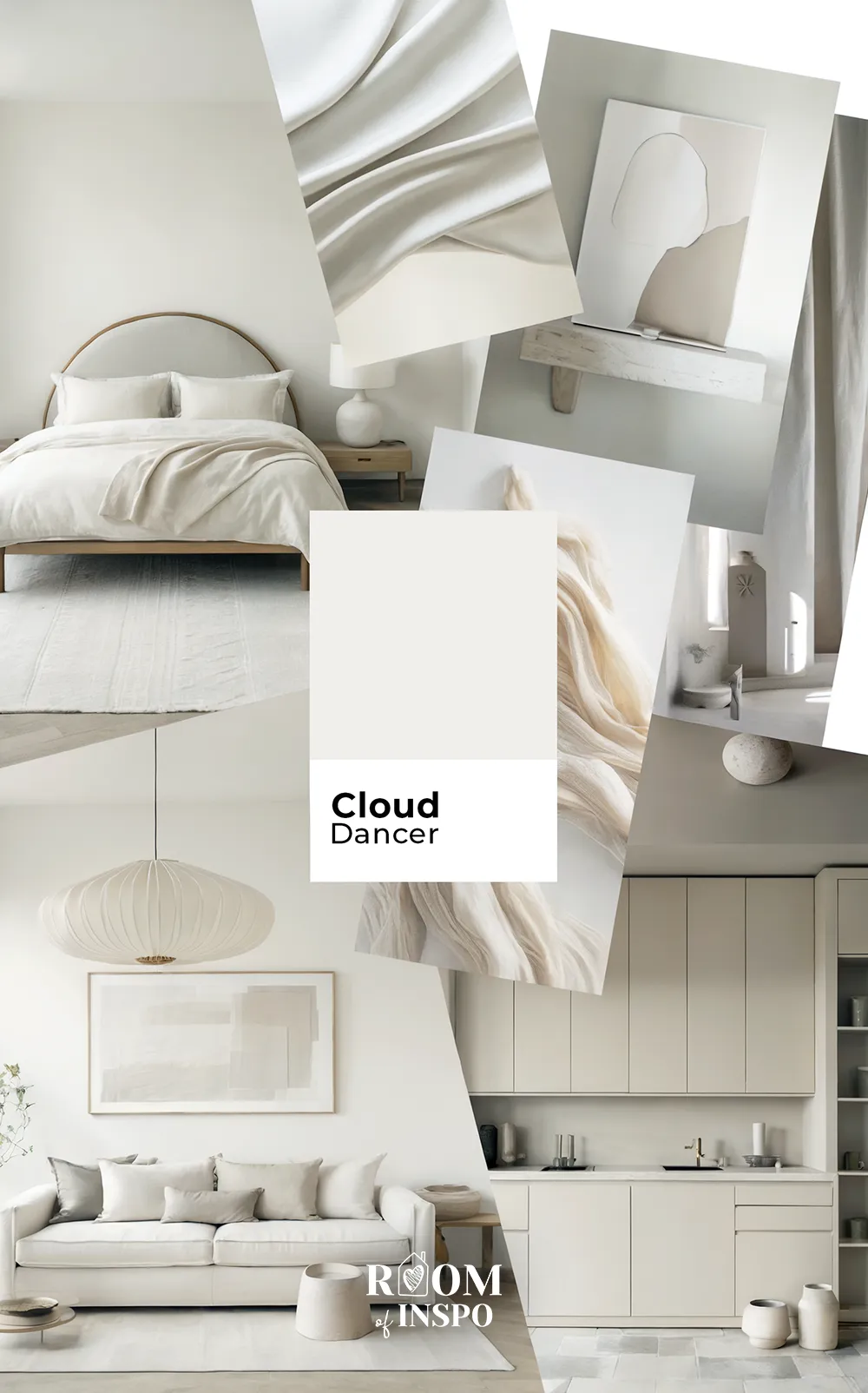
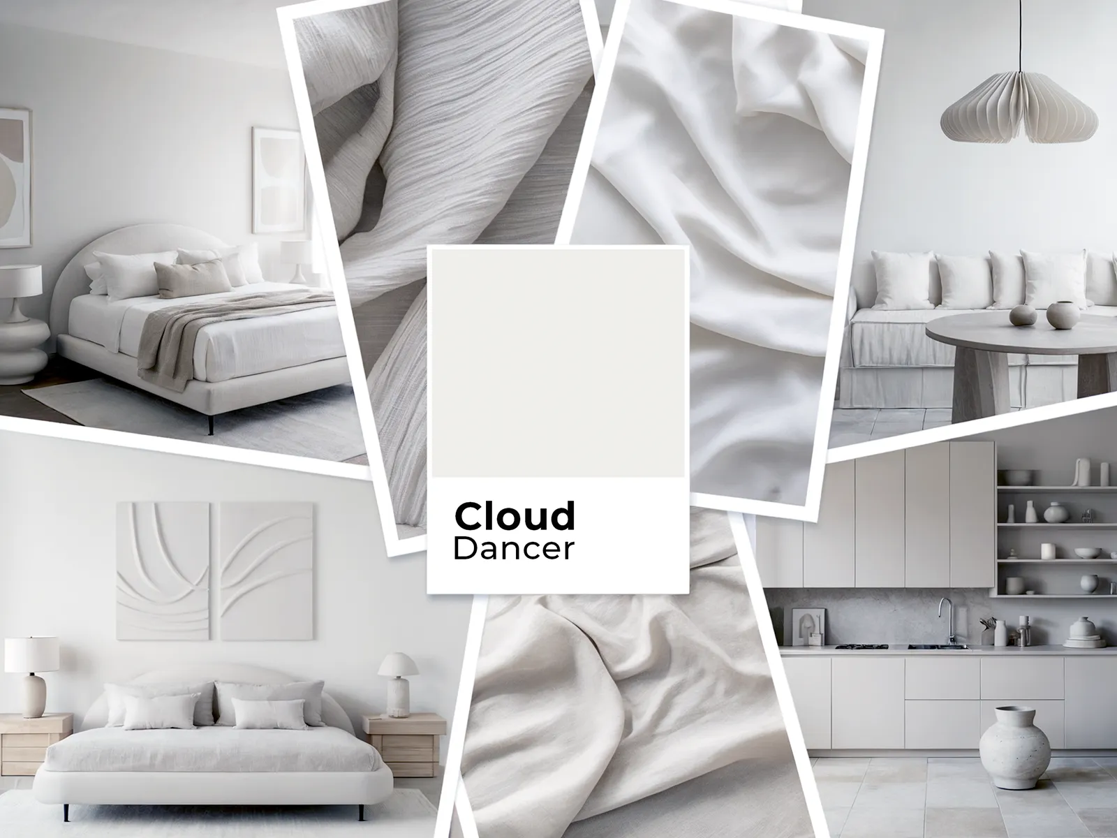
The Pantone Color of the Year 2026 is Cloud Dancer! Pantone 11-4201 Cloud Dancer is a soft, billowy white that brings a sense of calm and quiet to any space.


Described by Pantone as a “symbol of calming influence,” this airy shade invites you to slow down, breathe deeper, and give your mind some space to reset.

RELATED: Interior Inspiration for Pantone’s Color of the Year 2025 (Moca Mousse)
How to Style Pantone’s Cloud Dancer in Your Home
If you’re unsure how to use it, here’s what Cloud Dancer could look like in real homes. Below are 12 ideas that just might change how you see it.
1. A spa-like upgrade for your bathroom
Bathrooms and Cloud Dancer go hand-in-hand. This soft shade sets a soothing tone in a way that seems calm but never clinical, especially when you’ve got good natural light.

It plays well with polished stone, matte tile, and clean-lined fixtures, helping the space seem serene but still fresh.
Floating shelves, minimal hardware, and a sleek vanity all stand out more against this gentle white. Add warmth with rolled towels, a few textured details, or plants on the windowsill even the smallest bath starts to seem a bit more luxe.

2. Calm, collected vibes in shared living spaces
Living rooms thrive when they seem settled, and that’s where Cloud Dancer shines.
On the walls, it gives the whole space a quietly polished, open seem that works whether you’re styling something modern, traditional, or somewhere in between.

If your space leans modern, this shade tempers sharp edges and sleek furniture. In casual rooms, it highlights personal touches like artwork and greenery, without competing for attention.

3. A softer take on the classic Scandinavian bedroom

Bedrooms should feel like an exhale, and Cloud Dancer helps you get there… especially in Scandinavian bedrooms that emphasise light, simplicity, and soothing color. It creates a base that’s gentle, cohesive, and quietly stylish.
You can build a whole palette around it that includes soft textures and muted tones without losing that clean, uncluttered seem.

Think light woods, simple bedding, and cozy layers in linen or cotton. Even wool throws or warm grays pair beautifully. If your style leans minimal, this color keeps everything seeming soft rather than stark.

It’s also great in smaller bedrooms since it reflects light in a soft, flattering way. And at night? Total glow-up under warm lamplight.
👌 My top tip: Use Cloud Dancer in a flat or eggshell finish on the walls for a softer look. A dimmable lamp with a warm bulb makes it seem extra cozy.
4. Color that helps you focus

I’ve worked from a desk wedged between the kitchen and living room, so I know how important it is for your workspace to seem calm.
Cloud Dancer is a great base. It’s bright enough to lift the room, but soft enough to keep things from seeming sterile or stark.

It looks especially nice with built-ins, natural wood, and light-colored upholstery. And if you’re a plant person like my husband, this color makes the greenery pop in the best way.

5. Kitchens that seem easy and elevated
On cabinetry, Cloud Dancer reads clean and classic, but not too cold. It works with everything from shaker-style doors to sleek modern lines. Light wood accents keep the look warm, and it helps smaller kitchens feel more open.

It also supports natural stone counters and muted backsplash patterns without overpowering them (a harmony you’ll spot throughout 2026’s biggest kitchen design trends).
It’s the kind of color that makes updates seem less urgent, because everything already looks considered.

6. A bright lift for modern living rooms
Cloud Dancer is perfect in living rooms that lean bright and open. When your space gets decent light, this shade gives it a subtle glow that seems super fresh but not overly crisp.

It pairs nicely with warm wood tones, sculptural lighting, and low-key decor. Even minimal styling seems intentional because the color creates a solid, clean backdrop.
If your living room is part of an open floor plan, Cloud Dancer keeps things flowing. It quietly connects your spaces so the whole layout seems cohesive.

7. Lighten up your entryway or hallway
Entryways are often overlooked, but they set the tone for your whole home. Cloud Dancer brings in light and clarity, especially in tight layouts or areas with less natural light.

It looks gorgeous against wood benches, woven baskets, or neutral rugs. These textures introduce warmth without adding clutter.

Layer in lighting with wall sconces or a statement fixture to add depth. And don’t forget a plant or two even a small one makes the space seem more alive.
The result? A hallway that seems purposeful, not just a pass-through.

8. A clean base for kids’ creativity
White in a kid’s room? Yep, you can absolutely make it work.
Use Cloud Dancer on a crib, bed, or storage unit to create a light foundation that seems calm. Then layer in color through books, toys, and textiles that evolve as your child grows.

Sheer curtains, cozy rugs, and simple art prints keep the space soft and adaptable. And because it’s not too stark, Cloud Dancer seems kid-friendly without leaning juvenile.
🙌 Top Tip: Let color come from the fun stuff books, bedding, artwork so the white elements stay timeless and easy to work with.
9. Understated charm for outdoor details
If you’ve got a porch, railing, or even just a front step to style, Cloud Dancer is a solid choice. It keeps everything looking clean without seeming too crisp.

It plays beautifully with warm decking, layered greenery, or painted rockers, giving the whole setup that welcoming charm. It’s like a Southern porch but updated for wherever you live.

As the daylight shifts, this color reflects just enough to give your exterior a gentle glow especially pretty in early morning or golden hour.
10. Create a cozy reading nook wrapped in soft quiet
One of my favorite spots in our home is a tiny reading nook by the upstairs window. Cloud Dancer would be perfect in a space like that.
Use it on built-ins or the surrounding walls to keep things seeming open. Add a cushioned chair or bench, layered with neutral throws.

A soft-glow lamp and sheer curtains will give you that dreamy, cozy vibe for reading, daydreaming, or scrolling in peace.

11. A softly grounded focal point around the fireplace
Fireplaces are already natural anchors, but Cloud Dancer makes them look extra intentional. Use it on built-ins, mantels, or the surrounding wall to give the area a clean but not overpowering frame.

It reflects light softly, which helps the room seem brighter during the day and cozier once the fire’s lit.
It pairs beautifully with natural wood tones, soft ceramics, and greenery for a subtle contrast – a vibe you can see in some of my favorite modern farmhouse fireplaces.

👌 Styling tip: If you paint the fireplace surround in Cloud Dancer, choose a matte finish. It keeps things soft and seamless, rather than shiny.
12. White decor pieces that bring Cloud Dancer to life
Not ready to commit to a whole room? That’s okay. You can bring in Cloud Dancer through accents that are quiet but intentional.

Matte vases, sculptural bowls, or candle holders in this shade help open up shelves or mantels. Even one or two pieces can make a small space seem lighter and more pulled together.
Look for organic shapes and natural textures so it doesn’t seem too flat. Pale woods, soft ceramics, or woven details help balance the palette.
So… will we learn to love Cloud Dancer?
I think it’s already happening. Cloud Dancer isn’t going to steal the spotlight. And it doesn’t have to. It supports bold accents, elevates quiet corners, and makes everything seem more intentional.
Honestly, in a year where life seems loud, I get why Pantone picked a color that invites stillness. It also sits in an interesting place compared with Pinterest’s latest Predicts report, which leans heavily into bold, saturated, high-energy palettes. Cloud Dancer is practically the opposite of that. I suppose the truth will land somewhere in the middle, but only time will tell.
If you’re curious, start small. A pillow. A planter. Maybe curtains. Let the color ease into your space and see how it plays with what you already love.
And if it’s not your thing? That’s okay too. Color is personal. The best trends are the ones you make your own.
Curious about more trendy home decor posts? Check out these:
Save this post for later!


