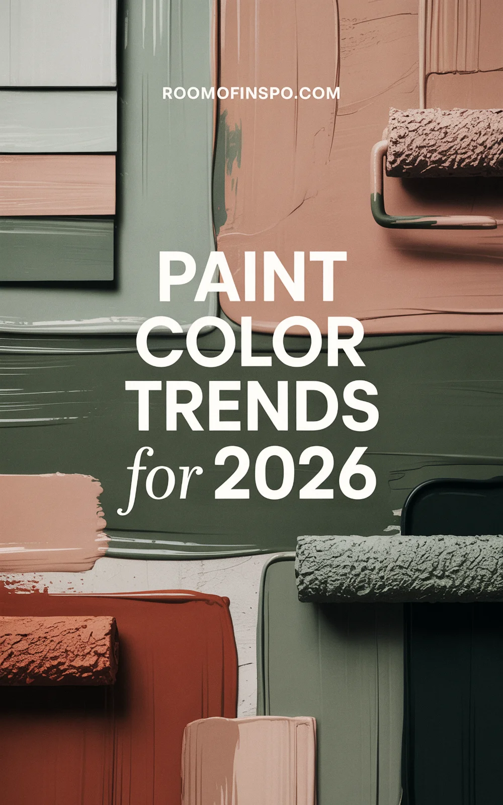
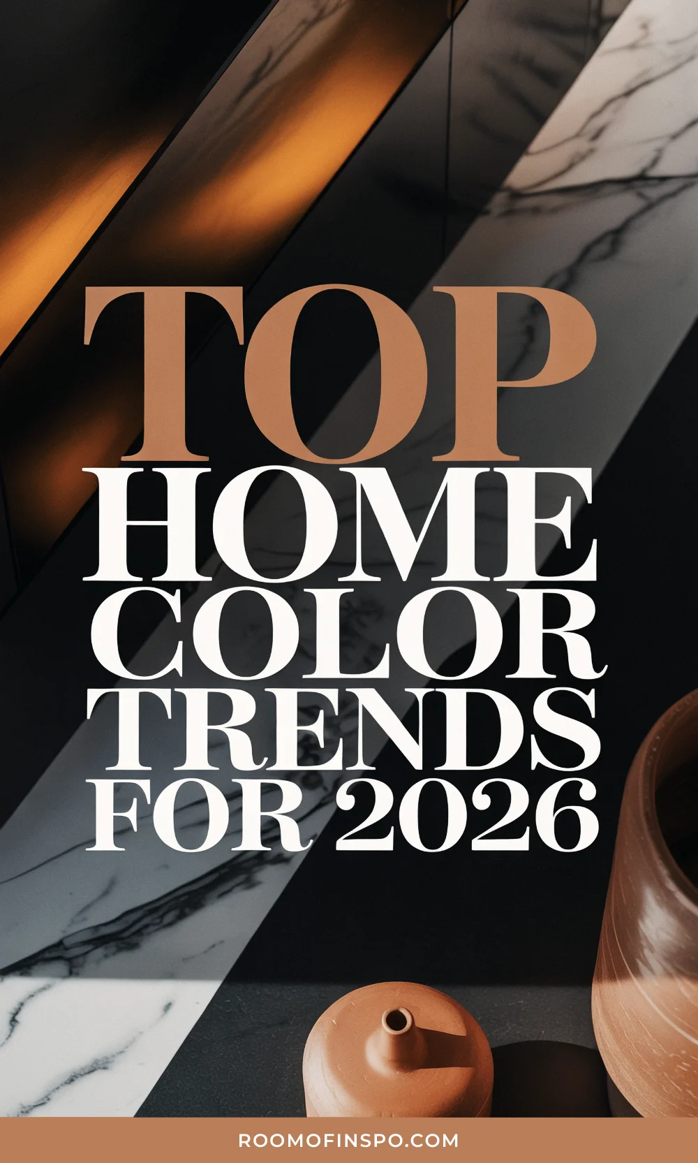
The 5 Hottest Paint Color Trends You Can’t Ignore in 2026
Some of the links in this post are affiliate links, including from Amazon and other trusted partners. If you click on the link and purchase the item, I may receive a small commission at no extra cost to you. You can learn more here.
The last time I pulled out my fan deck for some color inspiration, I ended up painting my hallway ceiling a bold navy blue. That one small risk turned into my favorite DIY lately, so it’s safe to say I have a soft spot for trying out new interior paint trends (even in unexpected places).
Each year, a fresh batch of colors shows up on my radar. Sometimes dramatic, sometimes a little more subtle, but always with a few surprises.
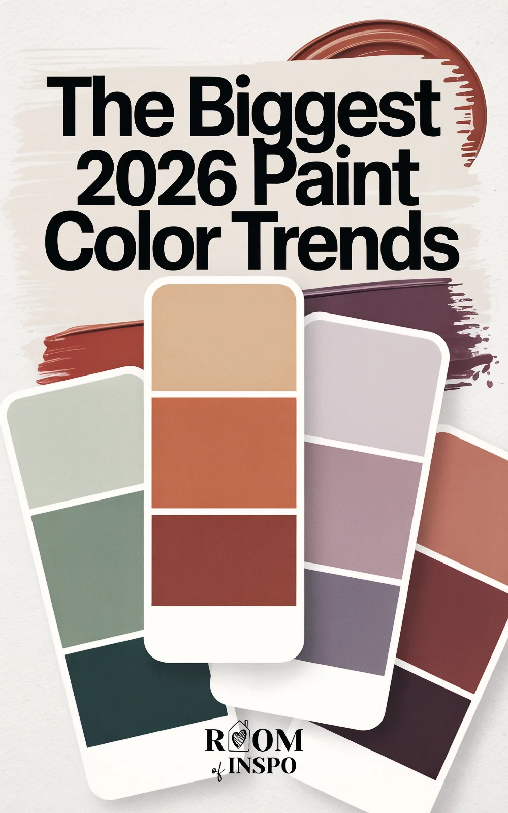
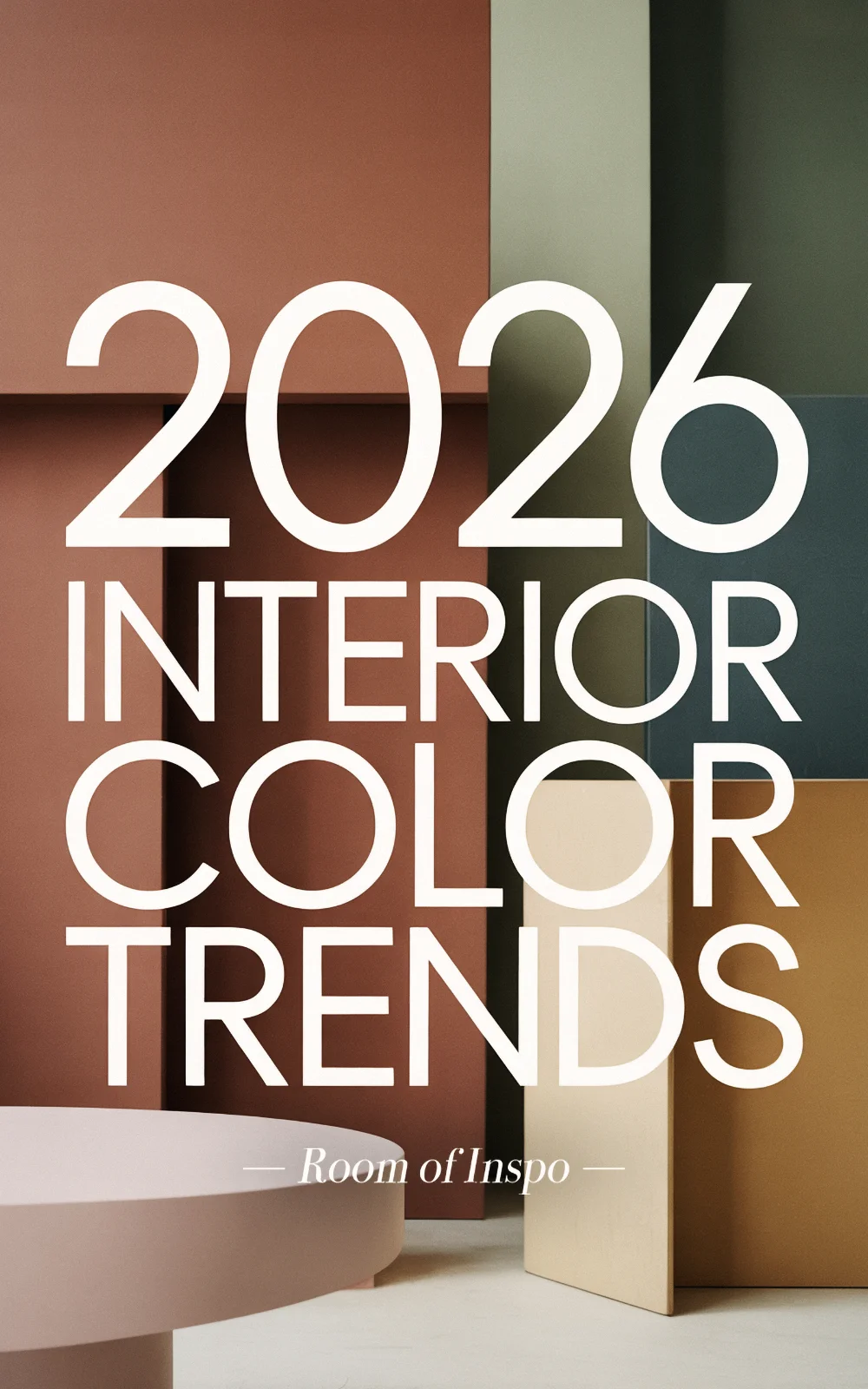
For 2026, the trends are mixing things up, with cozy browns, moody neutrals, spa-inspired greens, grown-up jewel tones, and even a controversial new spin on white making headlines. If you’re plotting a whole house refresh or just want a sneak peek at the 2026 color palette, these trends offer inspiration for every kind of project.
Ready to give your home a seasonal shakeup? Here are the five paint color trends of 2026 making waves right now.
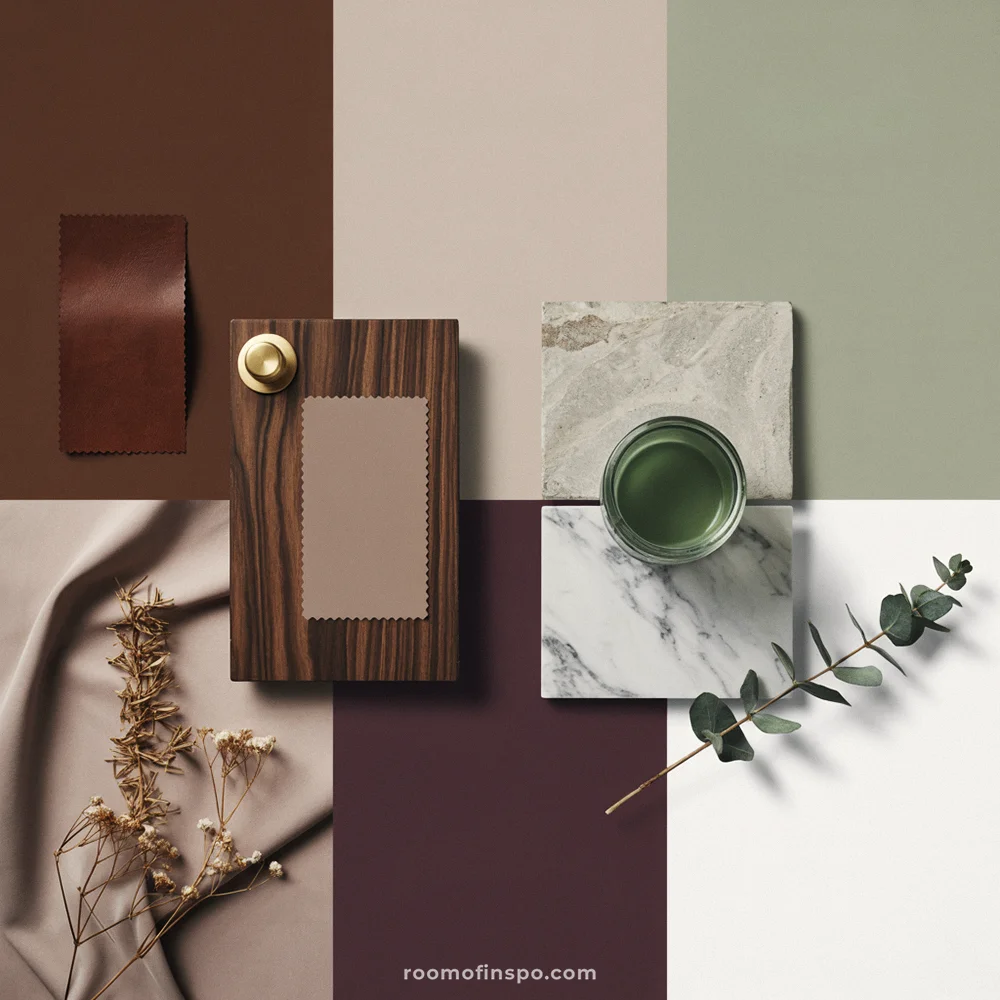
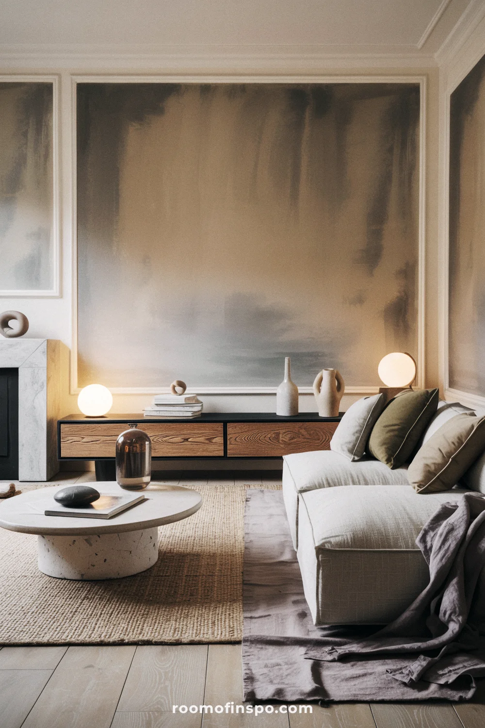
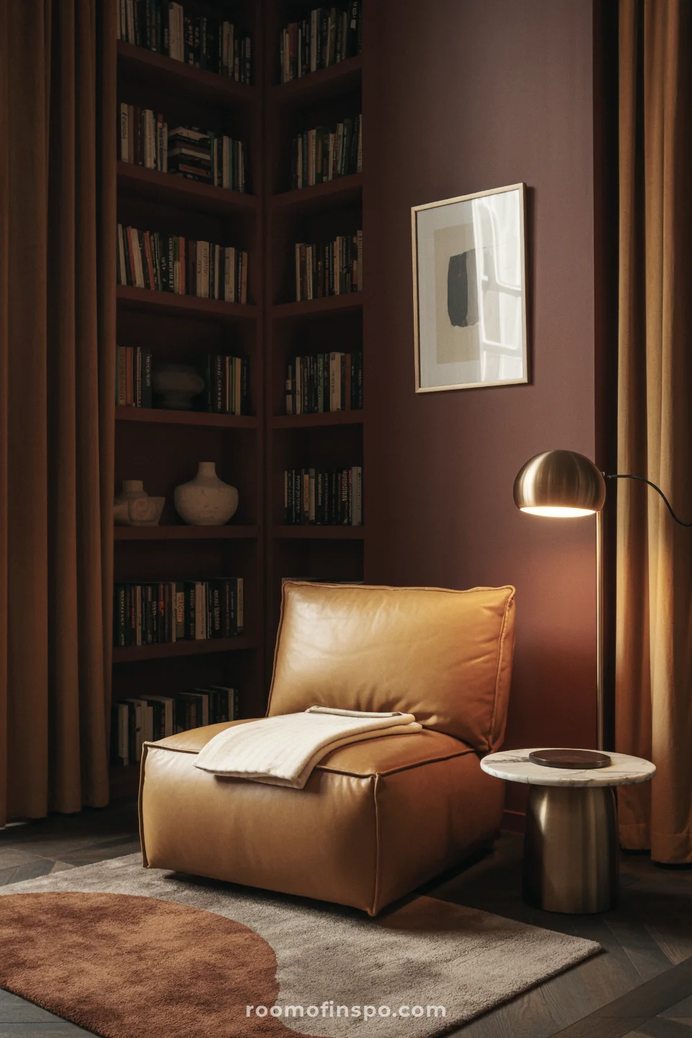
TREND #1 | Brown is the new black (and it’s cozy as hell)
For years, brown was relegated to the back of the fan deck, but I’m happy to report it’s making a major comeback as a chic and incredibly inviting neutral.
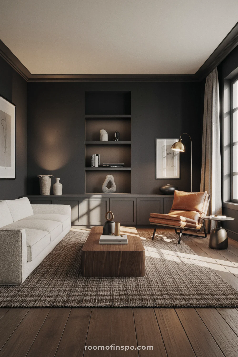
We’re not talking about the dated browns of the past; these are deep, rich, and complex hues that make a room feel instantly warm and luxurious.
Examples include Benjamin Moore’s Silhouette (AF-655), a gorgeous espresso-charcoal blend, or other rich tones like their Bittersweet and Sherwin-Williams’ Dark Auburn (SW 6034).
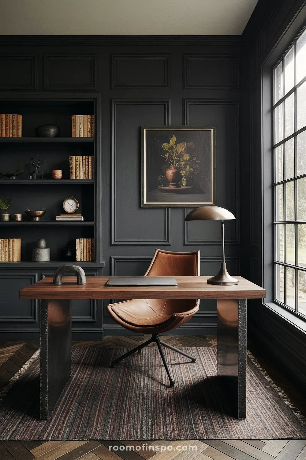
This trend is such a welcome reaction to years of cool, sterile grays. It’s the ultimate color for crafting a cocooning sanctuary… a space that literally wraps you in warmth.
It’s a new classic, and as everyone in the design world is saying, “brown is the new black when it comes to neutrals and interior design”. It feels both grounding and incredibly sophisticated.
Dark chocolatey hues like Benjamin Moore’s Color of the Year 2026, Silhouette, can be equally parts inviting and chic.
This mix of rich espresso hues with subtle charcoal undertones can be used across a variety of interior design styles and spaces, but it has a distinctive presence.
If darker and moodier colors are what you’re looking for, you might enjoy my posts on moody dining rooms and home office ideas.
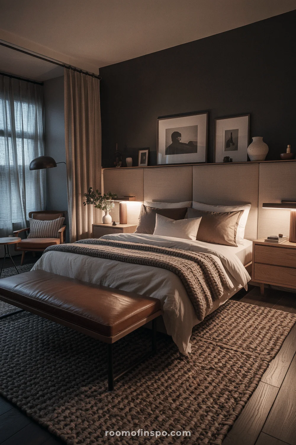
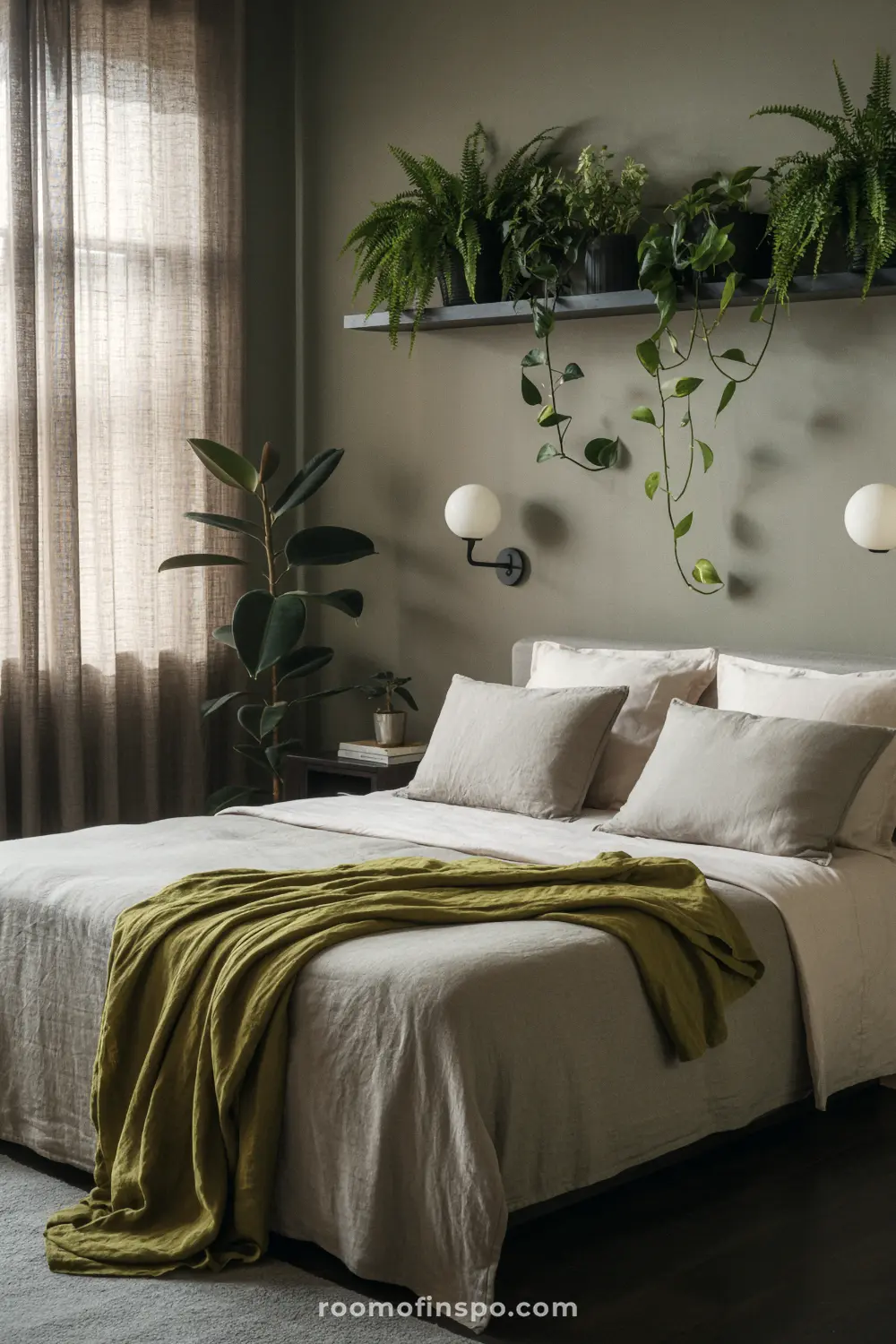
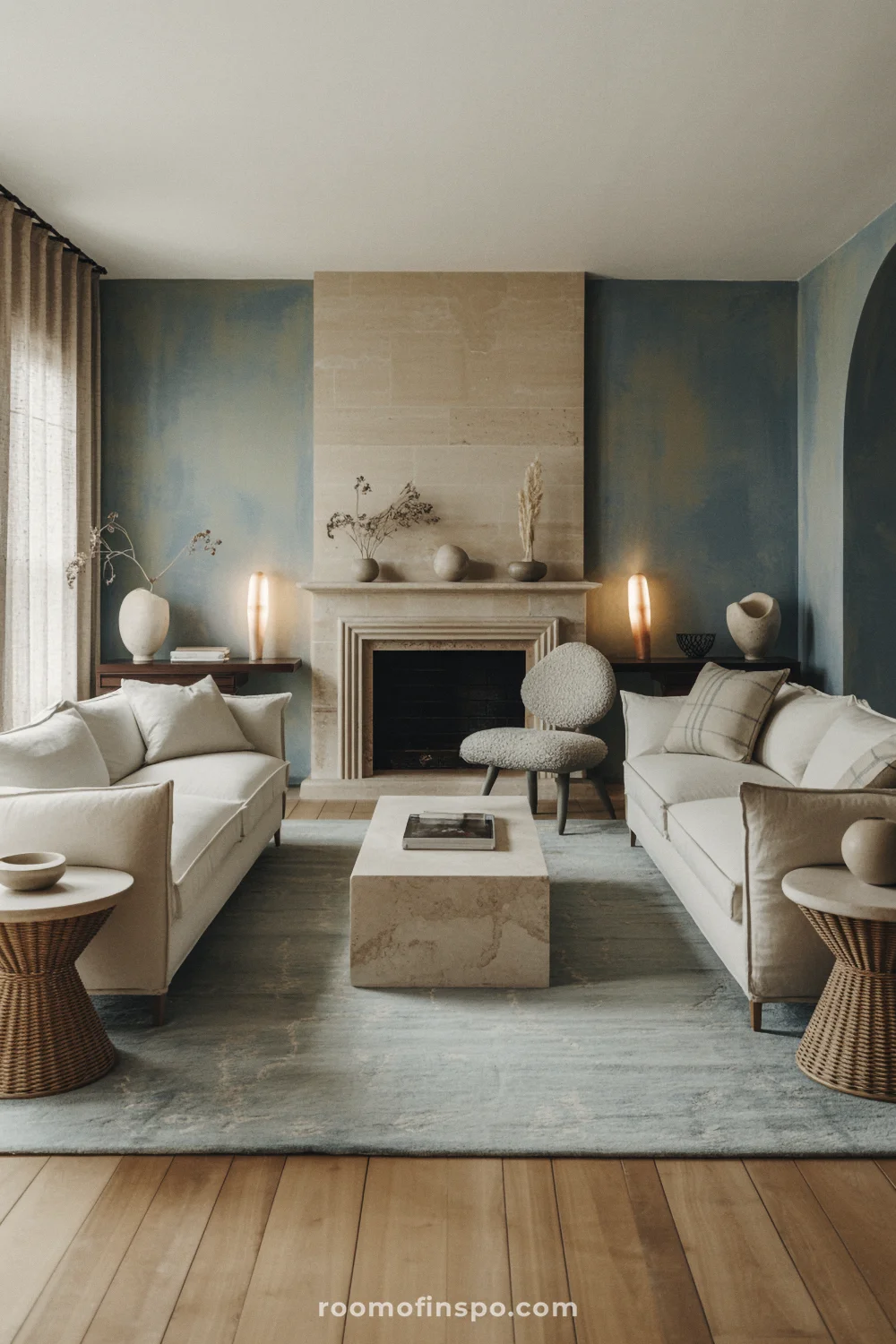
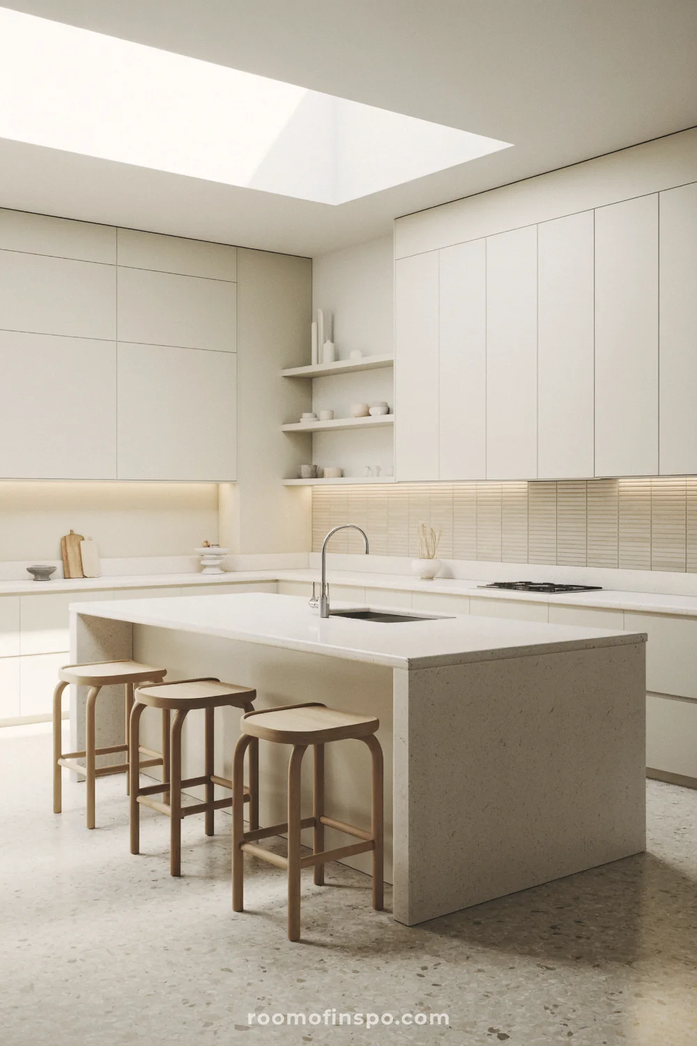
TREND #2 | Neutrals got a moody makeover: Meet “Mushroom”
I know many of us are tired of boring greige and the whole “sad beige” era, so allow me to introduce you to a new favorite micro-trend: “Mushroom”.
This specific color family sits somewhere between taupe, greige, and beige, but with subtle, organic undertones of earth, stone, and mist. It’s the perfect foundation for a calm, sophisticated sanctuary.
What makes these mushroom tones so special is how they feel moody, soft, and interesting. Greige is a people-pleaser… mushroom neutrals don’t care. They’re too busy making your room look expensive.
That’s because they shift beautifully in different lights.

A real mushroom neutral will often have a slight greenish cast under daylight, a mauve-gray cast in low light, or a warm stone-like feel at night. This complexity is what makes them feel so custom.
Colors such as Gossamer Veil and Farrow & Ball’s classic Cornforth White are ideal for creating a serene, grown-up atmosphere in any room.
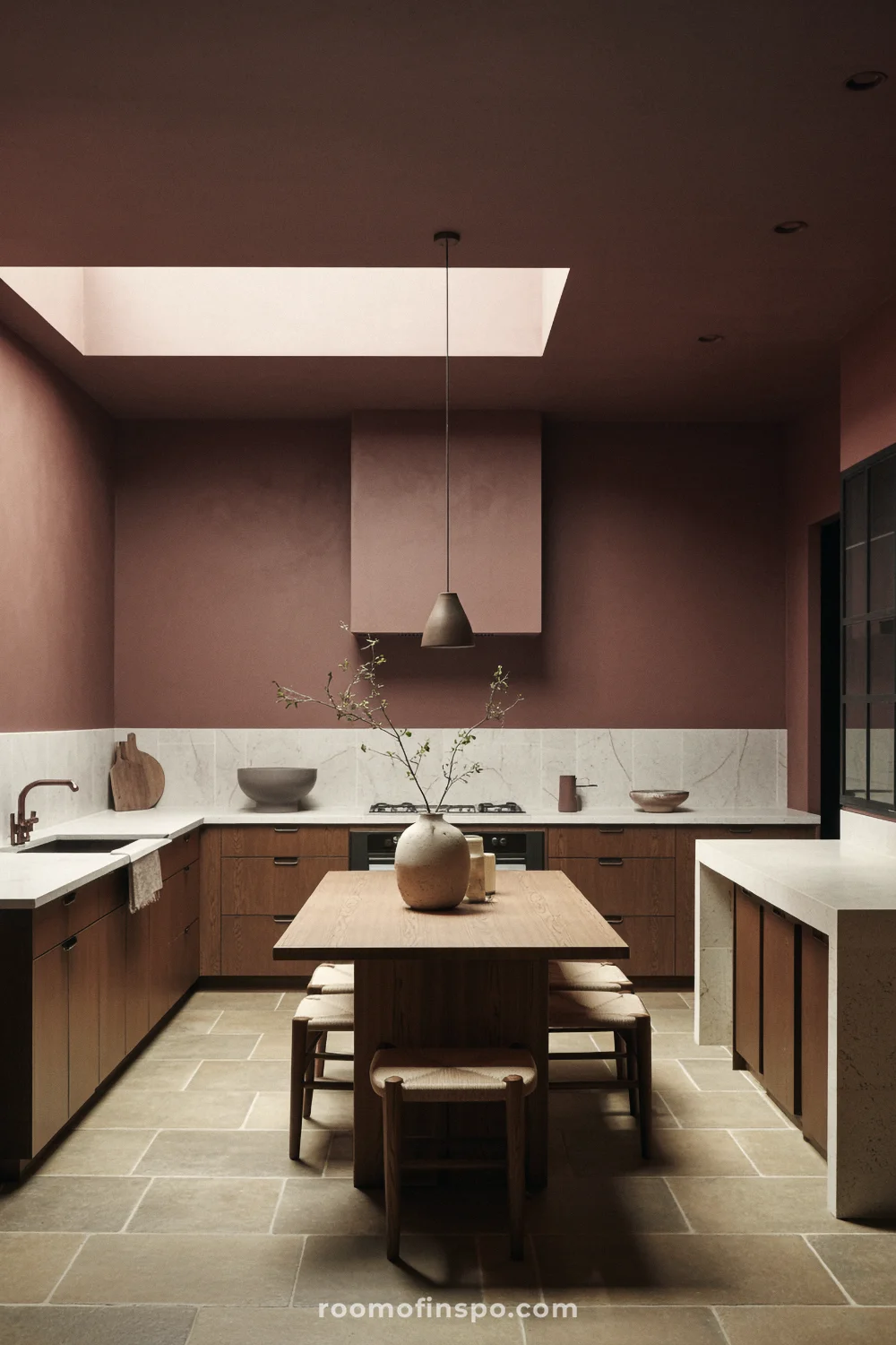
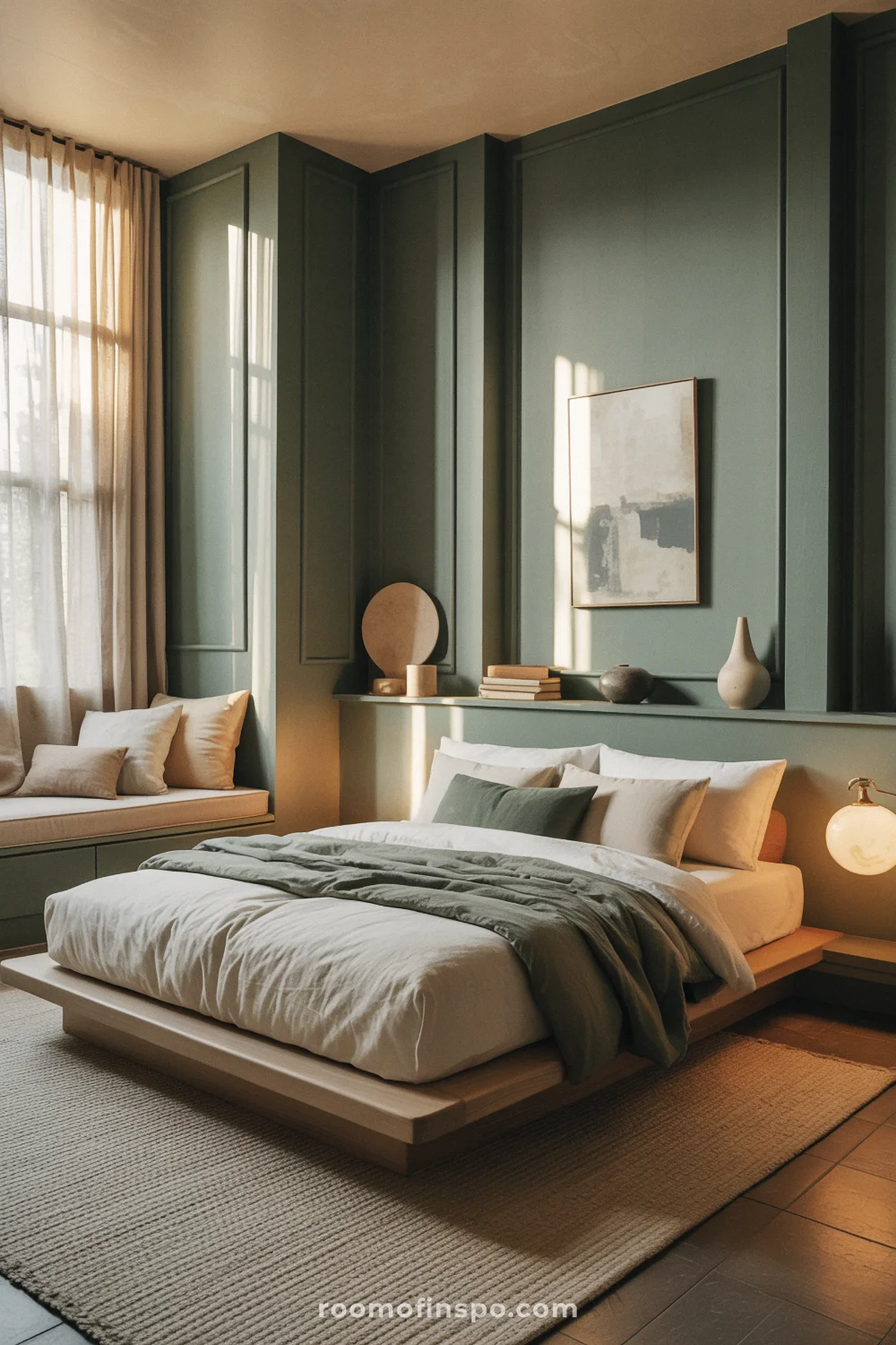
TREND #3 | Green isn’t gone, it just went to a spa
Green has been a design world favorite for a while, but for 2026, it’s taken a turn for the tranquil.
We’re moving away from bright, leafy greens and toward more mineral, smoky, and restorative tones that feel like a breath of fresh air.
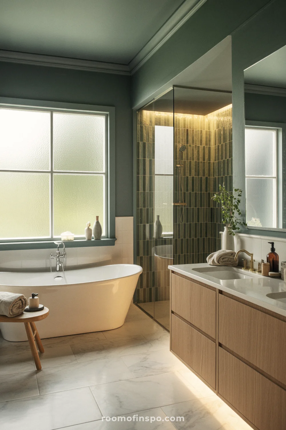
These new greens are so versatile they’re essentially a new kind of neutral, perfect for creating a restorative sanctuary in your home.
Behr’s Color of the Year, Hidden Gem (N430-6A), is a perfect example. It’s a “smoky jade” that masterfully blends blue and green into a rich, restful hue.
Valspar is on a similar wavelength with their pick, Warm Eucalyptus (8004-28F), a softer green with a silver-tinted quality that encourages restoration.
If you love that calm, nature-forward look, these tones pair beautifully with sage green living room ideas. This evolution is about bringing the calming feeling of nature indoors in a way that feels more sophisticated and lasting.
Valspar’s Warm Eucalyptus is a beautiful shade of green. According to the paint company, “its warm undertones create a grounded, welcoming mood while drawing inspiration from nature and the familiarity of retro design.”
🙌 My favorite trick: If you’re stuck between two similar greens, sample both and see how they interact with the light in your specific space. These calming hues can shift so much throughout the day, so check them morning, noon, and night to find your perfect fit.
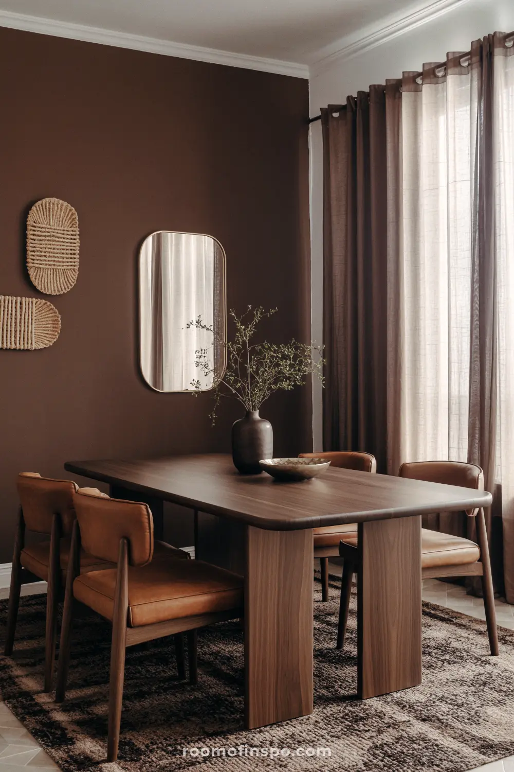
TREND #4 | Jewel tones are back, but they’ve grown up
For those of you ready to move beyond neutrals, you’re in luck. Saturated jewel tones are having a major moment, but with a sophisticated twist.
These colors aren’t loud or in-your-face. They’re bold but polished, creating a character-rich sanctuary that feels deeply personal.
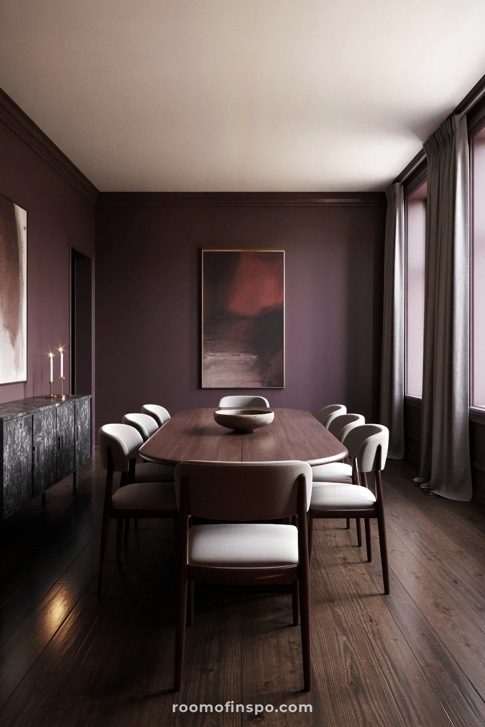
Deep, wine-like plums, rich burgundies, and earthy reds are standing out.
Gorgeous examples include Graham & Brown’s Divine Damson (a dramatic deep plum), Little Greene’s Adventurer (a grounded plum aubergine), and Glidden’s Warm Mahogany (a rich red-brown).

I find these colors are perfect for spaces where you want to encourage intimacy and conversation, like a dining room or a cozy reading nook. They create an incredibly intimate atmosphere that’s perfect for making memories.
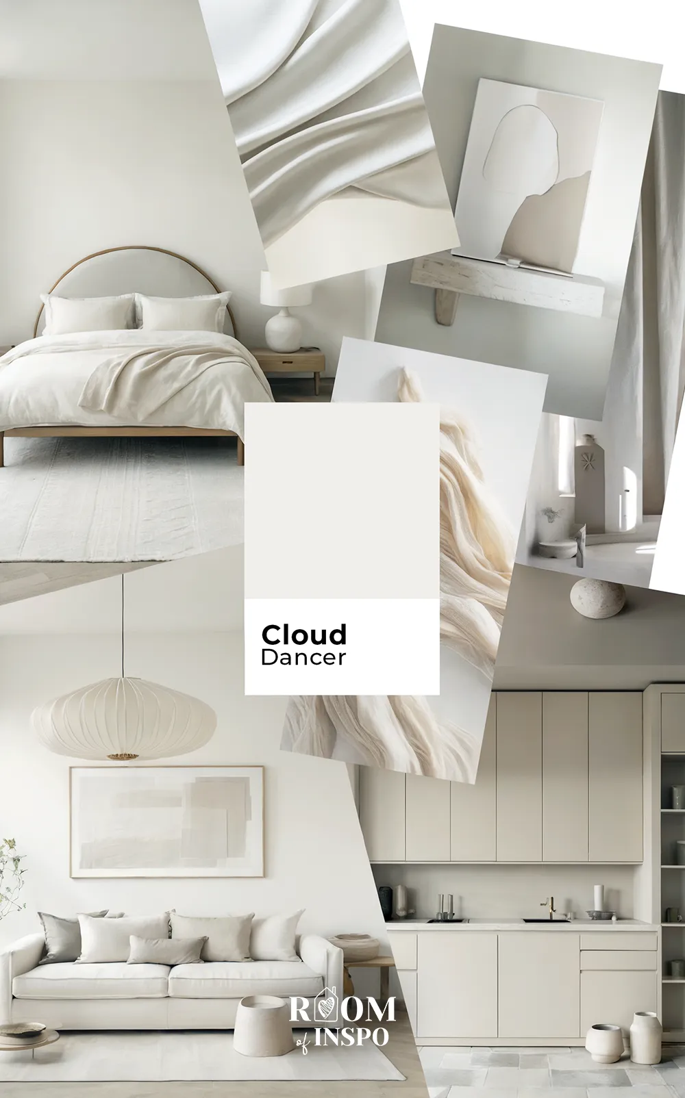
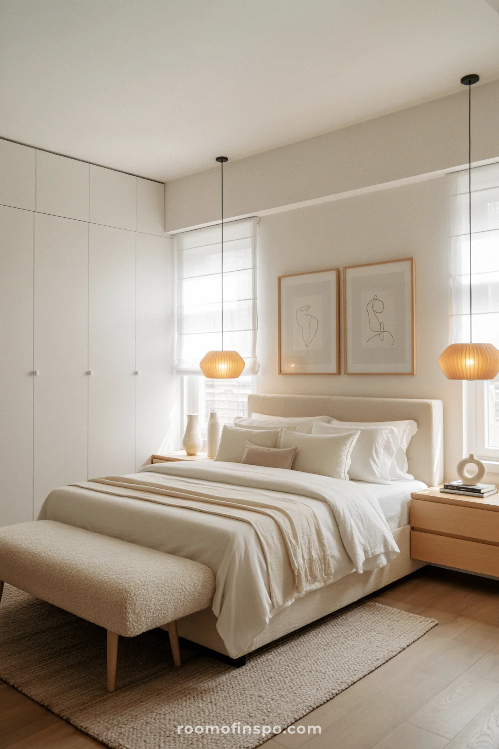
TREND #5 | The most controversial color of the year is… white?
And now for the trend that has sparked a thousand debates. Pantone, the ultimate color authority, announced its 2026 Color of the Year: Cloud Dancer.
And what color is that, you ask? It’s white. Just… white. This represents a different kind of sanctuary: one of mental clarity and quiet, an airy place for a cluttered mind.
Pantone’s rationale is that it’s a “lofty white that serves as a calming influence” in a world that’s rediscovering quiet reflection.
But designers and homeowners have had very mixed reactions. While some see it as a clean slate and an intentional “reset,” others feel it’s a missed opportunity to embrace the rich, soulful colors we’re all craving.
This whole debate makes a lot more sense when you see my full breakdown of the Pantone Color of the Year 2026.
Ready to play with color?
I kind of fun watching how paint color trends shift each year. If you came here scouting ideas for a bold new statement wall or just wanted to scope out the latest 2026 paint color trends, I hope you’re walking away feeling inspired to experiment with the current palette.
Trends come and go, but your space should always reflect your personality and the way you want to feel at home – whether that’s calm, cozy, sophisticated, or somewhere in-between.
Looking for more interior trends for your next home refresh? Check out my other posts:
Save this post for later!